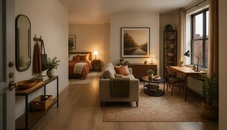
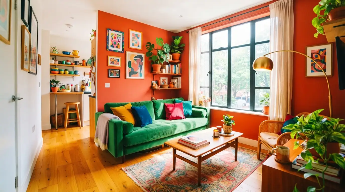
15 Studio Apartment Color Schemes That Make Small Spaces Shine
Color is the fastest way to transform a studio, and the right studio apartment color schemes do more than look pretty. They decide whether your one room feels cramped or calm, dark or bright, chaotic or pulled together. Paint, textiles, and furniture all speak the same language in a small space, so choosing the palette first makes every later decision easier.
The mistake most people make is decorating the studio piece by piece with no color plan. A blue sofa here, a green rug there, yellow curtains bought on impulse, and suddenly the room feels busy, restless, and smaller than it is. A defined scheme with two or three core colors, repeated across every zone, makes even 400 square feet feel intentional, calm, and twice as big. The fifteen palettes below range from soft neutrals to bold statements, and each one is chosen specifically for how it behaves in small rooms with real light.
1. Warm White and Natural Wood
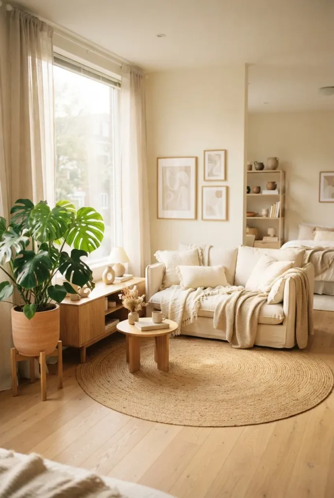
This is the can’t-miss foundation of small-space color. Warm white walls bounce light around the room while natural wood furniture keeps it from feeling cold or clinical. The warmth in the white matters: pure white can look harsh in a studio, but a creamy white feels soft and welcoming. Layer in linen textiles and one green plant, and you have a scheme that makes the walls visually disappear. If you are ever unsure where to start, start here.
Pro Tip: Follow the 60-30-10 Rule
Give 60 percent of the room to your main color, 30 percent to a secondary, and 10 percent to an accent. This ratio keeps any palette balanced, and it works for every scheme on this list.
2. Layered Beiges and Creams
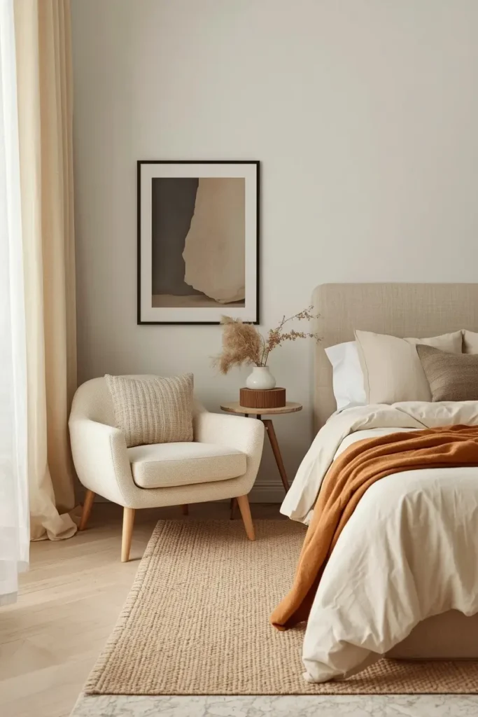
Beige got a bad reputation from boring rentals, but layered properly it is pure sophistication. Combine three or four beige tones, from pale cream to deep camel, across walls, upholstery, rugs, and throws. The variation in tone creates depth without any single color shouting. Add texture to keep it interesting: boucle, linen, jute, and light wood all read as different shades even in the same family. This scheme photographs beautifully and never goes out of style.
3. Why Sage Green Leads Studio Apartment Color Schemes for Calm
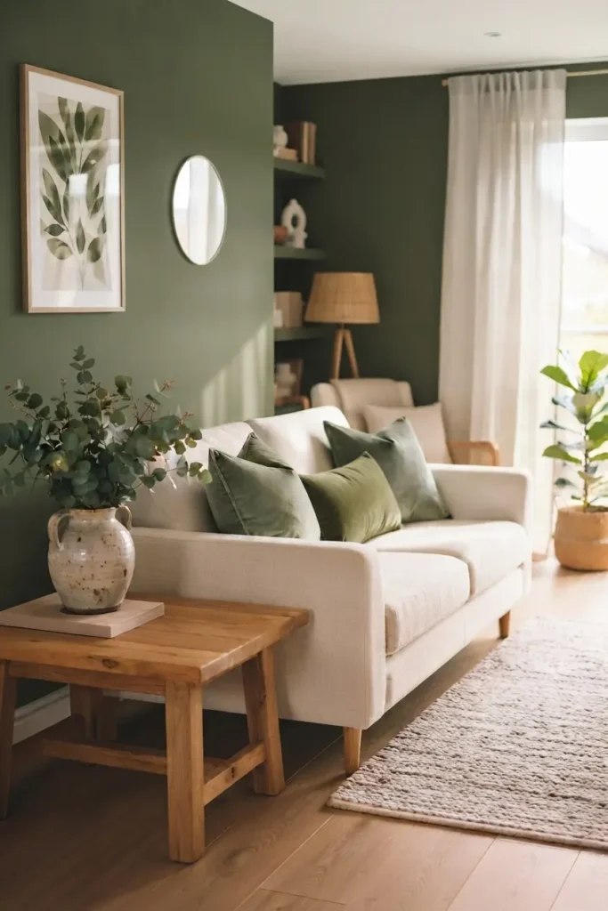
Sage green is the color designers reach for when a small space needs to feel peaceful. It sits between gray and green, so it reads as a neutral with personality, and it pairs with almost everything. Use it on an accent wall or a sofa, then keep the rest warm white with natural wood. Sage recedes visually, which makes walls feel farther away, and it connects indoor space to the outdoors. For studios that double as work-from-home offices, this is the palette that keeps stress down.
4. Terracotta and Cream

Terracotta brings the warmth of a Mediterranean afternoon into a studio. It works best as an accent: a terracotta accent wall, a burnt-orange sofa, or clay-colored textiles against creamy walls. The earthy tone makes a small room feel cozy rather than cramped, especially paired with rattan and warm wood. Keep the cream generous so the terracotta reads as a deliberate choice, not a cave. This is one of the most pinned palettes for a reason.
5. Navy and Brass: Bold Studio Apartment Color Schemes With Depth
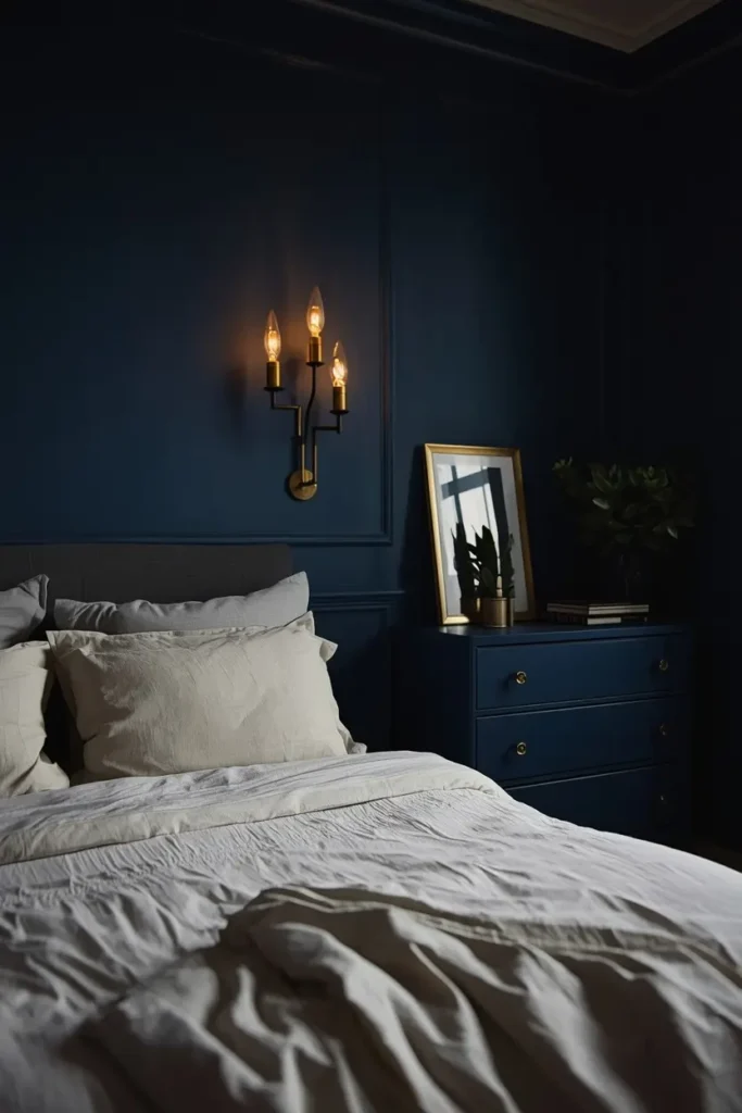
Dark colors in a studio sound risky, but navy done right adds incredible depth. The trick is commitment with balance: navy on one accent wall or a sofa, brass lighting and hardware to warm it up, and plenty of white elsewhere to keep things bright. Navy makes the wall behind it recede, which can actually make the room feel larger. These cozy studio apartment decor ideas show how deep tones create intimacy without shrinking the space, and navy with brass is the most elegant version.
6. Charcoal and Warm Wood
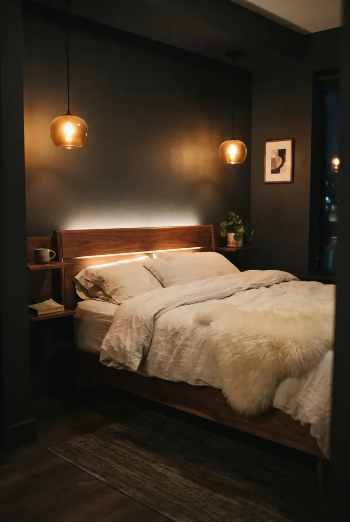
Charcoal is navy’s moodier sibling, and it turns a studio into a cocoon. Use it on the sleeping zone wall or on lower cabinetry, then warm it up aggressively with oak, walnut, and amber lighting. The contrast between dark walls and glowing wood is one of the most striking looks in small spaces. This scheme suits night owls and anyone who wants their studio to feel like an evening retreat. Keep textiles light so the room never feels heavy.
7. Blush Pink and Soft Gray

Blush pink grew up. Paired with soft gray instead of white, it reads as sophisticated, not sweet. Use blush on textiles, art, and one statement chair, with gray walls or a gray sofa grounding it. This palette flatters skin tones in a way few others do, which matters in a room where you get ready every morning. It works especially well in studios with good natural light, where the pink glows warm in the afternoon.
8. Olive Green and Rattan
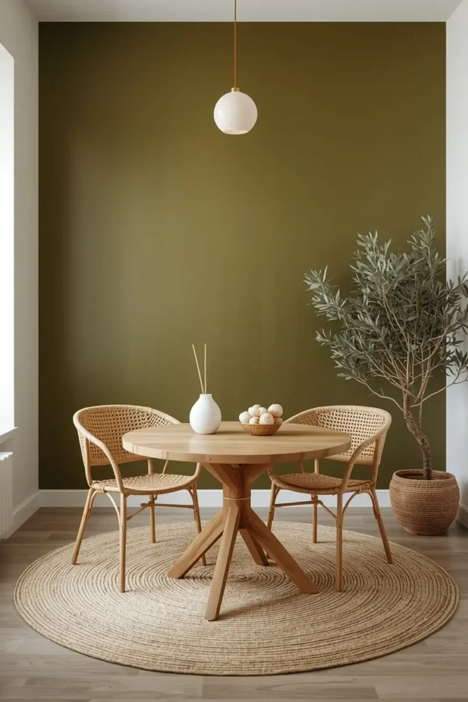
Olive green brings an earthy, collected feel that works beautifully with natural materials. Pair it with rattan, jute, cane webbing, and warm whites for a scheme that feels like a permanent vacation. Olive is deep enough to anchor a room but natural enough to never overwhelm. It hides wear better than lighter greens, which makes it practical for high-use pieces like sofas. Add brass or black accents to keep it from feeling too rustic.
9. Black and White Monochrome
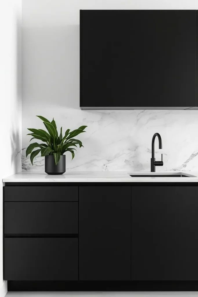
Nothing looks more modern in a studio than a disciplined black-and-white scheme. White walls and bedding keep it bright, black furniture and frames add graphic punch, and the high contrast makes the space feel crisp and intentional. The secret is texture: without color variation, you need linen, wool, marble, and wood grain to create visual interest. One green plant is the only exception you need. Monochrome also makes art pop, so it suits collectors.
10. Mustard Yellow and Warm Gray
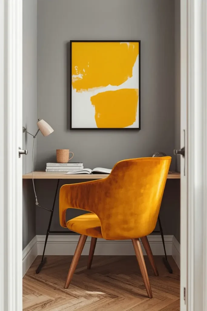
Mustard yellow is joy in color form, and warm gray keeps it sophisticated. Use mustard on a single armchair, bold curtains, or vibrant art, with warm gray walls or a gray sofa as the calm base. This combination energizes a studio without the chaos of brighter yellows. It is especially good for north-facing rooms that need warmth. If your studio ever feels gloomy, this palette is the antidote.
11. Dusty Blue and Crisp White
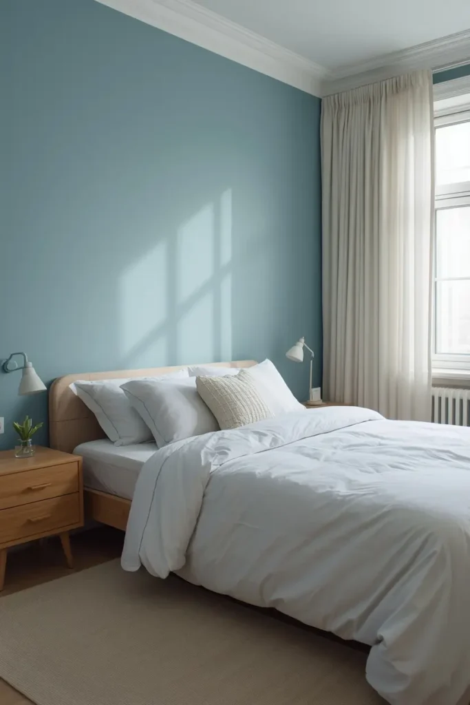
Dusty blue is the color of a calm sea, and it makes studio walls feel farther away. It works on all four walls in a small room because it recedes rather than advances, especially paired with crisp white trim and bedding. Add natural wood and soft white textiles to keep it from feeling cold. This is one of the safest bold choices for renters too, since dusty blue looks intentional even as just curtains, a rug, and bedding with white walls.
12. Clay and Linen Neutrals
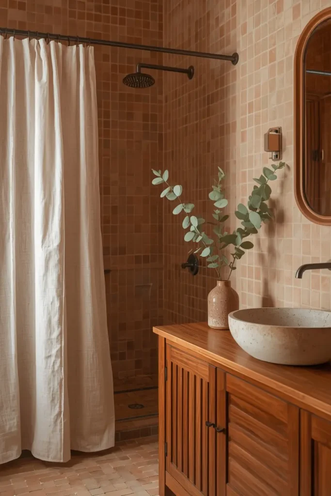
Clay tones, from pale peach to deep adobe, layered over natural linen create the most organic scheme on this list. Everything looks touchable: washed linen bedding, a clay-colored wool rug, ceramic vases in earthy glazes. This palette suits studios with lots of natural texture and minimal furniture. It feels handmade and human in the best way. Keep the lighting warm to let the clay tones glow in the evening, and when the palette is settled, these budget studio apartment decor ideas show how to bring it to life without overspending.
13. Emerald and Gold Jewel Tones
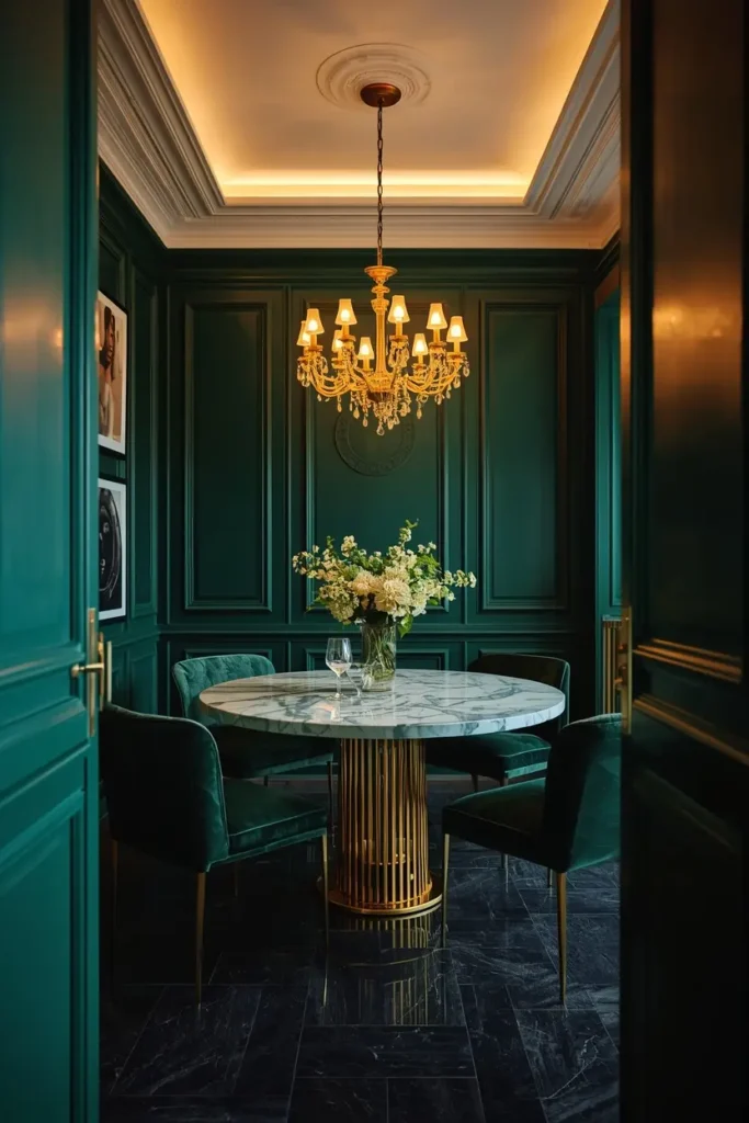
For maximum drama, emerald green with gold accents turns a studio into a jewel box. Use emerald on a velvet sofa or an accent wall, gold in lighting, mirrors, and hardware. Keep the remaining walls a warm white so the jewel tones have room to breathe. This scheme demands confidence, but the payoff is a studio that looks designed by a professional. It photographs spectacularly, which your Pinterest audience will love.
14. Coastal Blue and Sandy Beige

You do not need an ocean view to borrow the coast’s palette. Soft blues ranging from sky to seafoam, layered over sandy beiges and whites, make a studio feel breezy and open. Natural fibers are essential here: jute rugs, linen curtains, light driftwood tones. This scheme is practically made for small spaces because light blues visually expand walls. It stays fresh year-round and never feels heavy.
15. Chocolate Brown and Caramel

Rich browns are back, and they bring incredible warmth to a studio. Chocolate walls or a deep brown sofa, caramel leather accents, cream textiles to lift it. This palette feels like a hug, especially in the evening lamplight. The key is contrast: without cream or caramel to break it up, brown can go muddy. Done right, it is the coziest scheme on this list and a welcome break from the all-gray trend.
Pro Tip: Test Swatches in Your Own Light
Paint colors shift dramatically between morning and evening light. Tape large swatches to the wall and live with them for two full days before committing. What looks perfect at noon can turn muddy at dusk.
Studio Apartment Color Schemes: Small Space, Big Personality
The best studio apartment color schemes prove that small rooms are not a color limitation, they are a color opportunity. One room means one palette, which means every choice reinforces the rest. Pick the scheme that matches your light and your life, commit to the 60-30-10 balance, and repeat your colors across every zone. Before you buy anything else, it is worth reading Apartment Therapy’s guide to the best paint colors for small living rooms, since their designer picks confirm what works in real small spaces. A studio with a confident palette always feels bigger than the same room decorated at random.